Townsend Library


Overview
For this case study, I picked the website of Townsend Library where one of friends is working as an assistant librarian. One day she brought it up and complained about the messy website, asking for my input since she knows I have experience in web development and UX design. After I checked the website, I figured there was a lot of space for improvement and decided to do a case study with some new sample pages that she can present to the administrator of Townsend Library asking for a redesign. According to my friend,
“The Townsend Public Library is located in Townsend Massachusetts in the United States, about an hour outside of Boston. It serves the population of Townsend, a community of under 10,000 people as well as visitors from neighboring towns.”
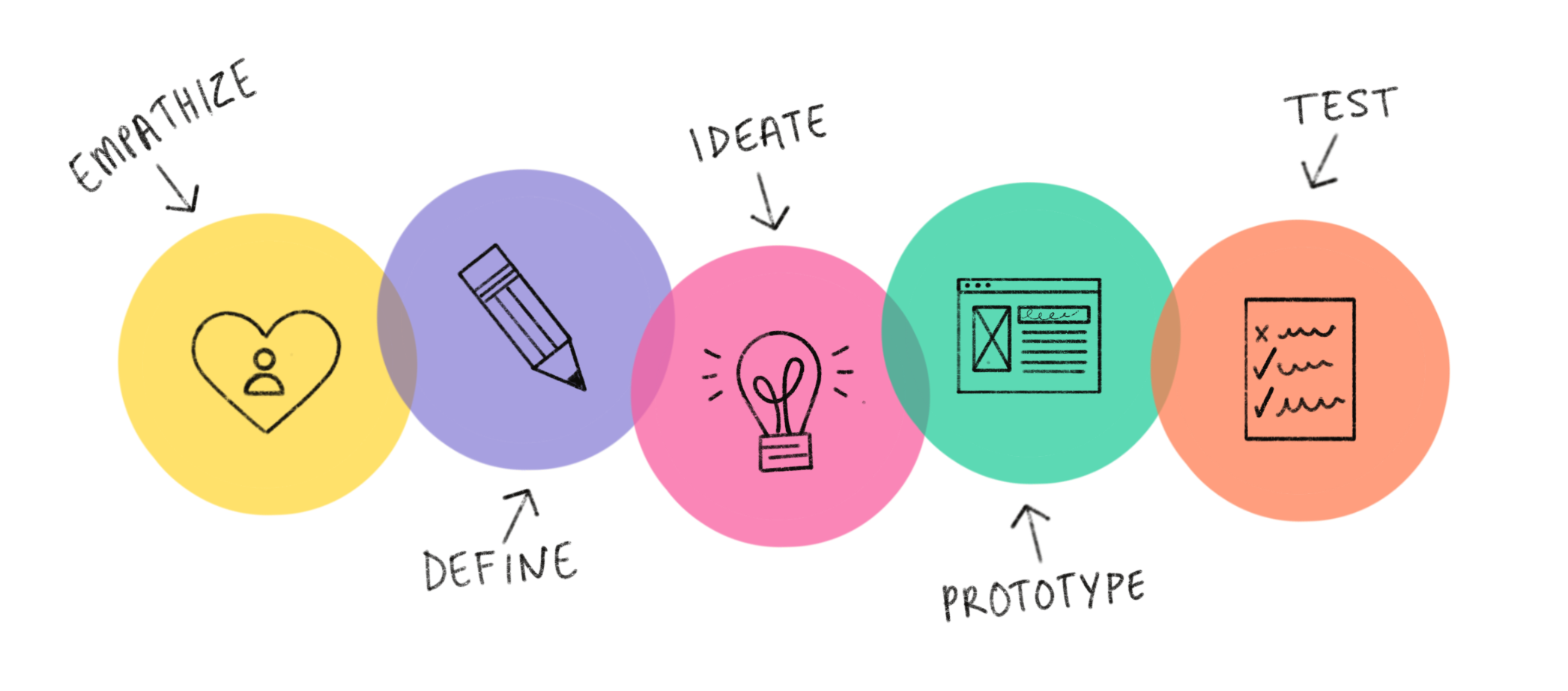
I used the 5-stage Design Thinking model that is taught at Stanford d-school for the homepage of the library website. Although it is not necessarily a liner approach, I choose it to be liner just for the simplicity because I am not creating a new product. Rather, I am redesigning an existing website.
Emphasize
Before jumping directly into the current website, I wanted to know the user group, that is, what this library website is designed for? Luckily, since my friend is working at the front desk, she shared with me what some frequent questions people asked her in the library. Based on her experience and my own research on the user, I have come up with a list of needs of the user group:
1. Access online book contents in online catalog for themselves and their children
2. Reserve books or other resources using their member accounts
3. Know the library opening hours
4. Sign up events for themselves and their children
5. Use digital equipment including library computers, printers, scanners, etc.
It should also be addressed that seniors represent a considerable portion of the user group as the library becomes their social hub after they retire. Therefore, the design of the website should follow the guideline of designing for the older generation created by W3C.
Now I will go to the their current website and do an assessment from a user’s perspective, trying to find pain points for the user. Let’s start from the navigation bar:

I immediately get lost and frustrated about the nav bar:
1. Some taxonomies on the main nav bar look vague to me. For example, “For You” does not convey what exactly this menu item is about2.
2. The three lines of other menu items on the right do not fit in with the nav bar3.
3. Other visual aspects such as inconsistent font size, the bad alignment and empty space
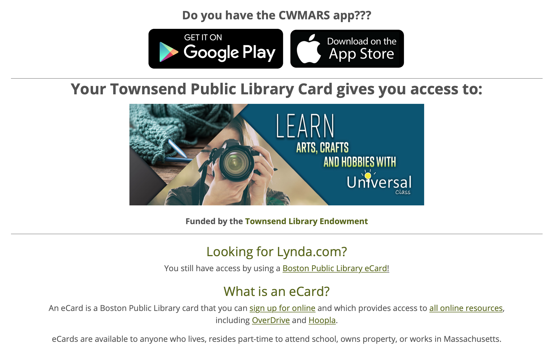
Continue on the homepage, I see information about tax return and a section of featured contents. As shown on the image below, the images are hard to read and inclinable for magnification.

Moving forward, I have some text about a mobile app with a confusing name, the library card, Lynda.com and e-card that looks to me not well organized. For example, why is the tax return information not here but together with the feature contents shown before? And what’s the difference between the “library card” and “eCard”?
Finally, I am at the footer that has a completely different menu from the top nav bar. I get lost again because I am not used to having a website with inconsistent menus. I find the inconsistent background colours on top nav bar and footer unappealing as well.

Define
From the assessment, it is obvious that the current website has a hard time fulfilling the needs of the user as there are two major problems with this website: the information architecture and the organization of content on the homepage. The information architecture problem manifested itself on the navigation including the confusing taxonomies and unorganized menu items all over the place. The organization of content is about those random information about the library card, app, tax return, etc. Clearly the original designer cannot figure out a place to organize them in a block and it should also be noted some information are more appropriate to appear on some sub pages rather than the homepage.
Ideate
Based on “Define” stage, a new information architecture and a new scheme of organizing homepage content is needed. For the IA, I created a new site map in respect to user’s needs.
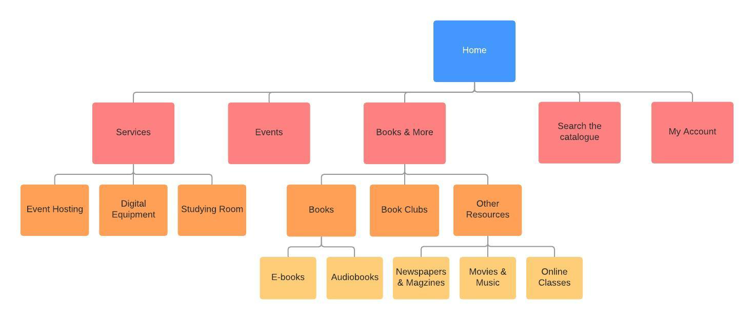
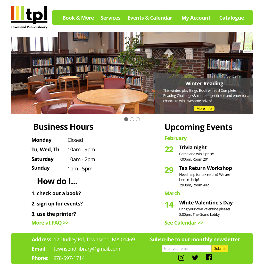
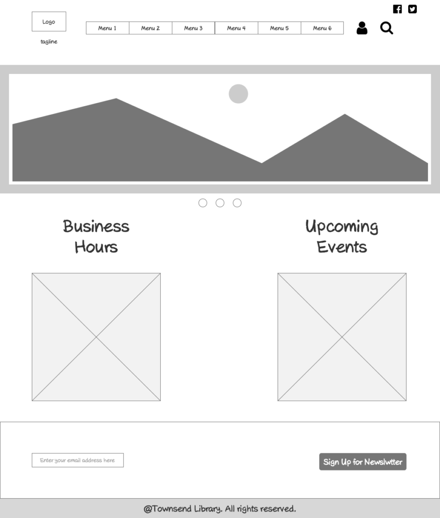
In order to reorganize homepage contents, I went to one of the similar websites I worked on before, RecWell , a college sports complex at University of Wisconsin-Madison for inspiration. Then I decide to have a slider to include feature contents (newest event, library card, mobile app, etc.). Since the user group wants to know the business hours and event schedule (for sign up), I am going to build two columns for each so that the users can see them immediately. I also included a newsletter sign up block because it is fairly important and should be on the homepage whereas in the current website, it is buried somewhere deep in the menu. Because I want to keep the homepage clean with only essential information, that will be all contents on the homepage.
Prototype & Test
I used Axure RP to create the low-fidelity prototype and shared it on Axure Cloud for usability testing.
I asked my friend working in the library to present my lo-fi prototype to the people there and I also showed it to my friends for feedback. Some important feedbacks include:
1. The search icon in the menu bar is confusing. It can mean keyword searching on the website or it can mean search the online catalog (a library jargon meaning the database about books)
2. The account icon on the menu bar is not very informative and intuitive to seniors in the library
3. The business hours seems to occupy too much space on the homepage
4. There is no information about the library contact methods (another example of “I am not the user”).
Based on those feedback, I have come up with the following modifications:
1. Integrated “my account” and “search the catalog” into the nav bar with words, no icons
2. Added a “FAQ” block underneath the business hours
3. Included the contact information, social icons and newsletter sign up into the footer
And the final polished hi-fi prototype (created by Sketch) is below: